










comment by Angry Retired Bastard on 08 April 2016
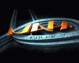
Nice logo. Everything else feels very dated (in a not-so-nice way).
comment by z5 on 08 April 2016
So it seems MRK is officially back on the amiga scene? Great news if that is the case. The logo is awesome and i like the credits and end scene pictures. Code wise, this is Phibrizzo's best work so far. I especially appreciate the effort put into transitions between parts. However, some of the color choices are unfortunate and i was never a fan of the textured background (iirc was quite popular in some of the Scoopex intros like Superautodrome). A better, more consistent color choice would have helped the intro quite a bit.
But overall, i feel the progress is there so keep it up!
comment by magicnah on 14 April 2016
Yep.. MRK is back on the scene.. in nah-kolor & insane..
MRK did some graphics to in our Shema intro in 1998 :)
comment by corial on 03 May 2016
Well, actually mostly what Slummy said. Many kb's must have been spend on the superb logo leaving a little too little for the remaining audiovisuals. The code looks good though.
Please log in to add a comment!
User Votes: Average: 3 points (3 votes) |
Please log in to vote on this production!
|