




comment by z5 on 07 April 2016
Short but sweet. Well thought out and good flow/transitions and i like the visuals and color choice. Holds a lot of promise for a bigger second release (which seems a hurdle to overcome for most comebackers).
Welcome back!
comment by sachy on 12 April 2016
Definitely too short, but I like the attention given to all the small details. We all know that these things take a lot of time and effort. I'm glad Dan is back and hope for a lot of new prods from Lemon. :)
comment by rloaderro on 12 April 2016
Looks very polished all the way!
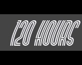
I saw someone say that there is antialiasing on the waving 120 hours logo.
Does it mean that there are multiple pre-antialiased horizontal spans to facilitate "sub-pixel" scrolling with AA? In that case I think it's may be a first. :)
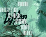
Love the graphics by Facet, but how about some *cough* AGA for this pic? I bet the original is true color.
comment by magicnah on 14 April 2016
It was an honour to support and do some real hardware testing for this prod. Welcome back Dan! :-D
comment by dan^Lemon on 16 April 2016
There are no preantialiased horizontal spans for the logos (although that IS a method that I could have used). The method I went with, uses bitplane shifts and palette change on each line ;) and yes, I believe it is a first for A500 OCS :D
comment by rloaderro on 20 April 2016
Neat! And should be less memory intensive than the method I was thinking about.. Also more levels of AA can be done
Please log in to add a comment!
User Votes: Average: 3.25 points (4 votes) |
Please log in to vote on this production!
|