

comment by z5 on 26 August 2015
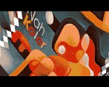
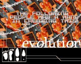
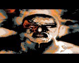
Due to the people behind this intro, i expected a bit more tbh. Having so many people working on gfx results in too different styles of gfx, especially for a an (small) intro. Also, the main scene offers a neat picture but it's too overcrowded and has too many different fonts. Less would have been more in this case.
I did like the tune, the rotator and especially the effect on the font though. That was a nice touch.
In any case, it's nice to see Deestay back and i look forward to more in the future.
Please log in to add a comment!
User Votes: Average: 2 points (1 votes) |
Please log in to vote on this production!
|