


comment by z5 on 17 February 2013
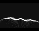
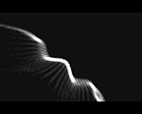
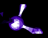
Mostly recycled content and inconsistent visuals/colors BUT i like this one a lot. I've been watching it quite a bit. The tune is amazing and the synch is great. I loved the first scene: the dots landscape combined with the music and the nice font(writer). The bubbles look great too, shame about that font though. And the effect in screen 9 is cool too. In fact, most of it is good. I wish you had kept the greyscale look throughout and only used that one font from the start / end part. I could have been a seriously cool intro. As is, it's still very enjoyable.
comment by corial on 17 February 2013
This is not good.Decided very late (for me) that an intro should be made for Datastorm,thus I had to reuse as the new content will be used for the Revision intro.Anyways,this prod was also mostly made to welcome Cheesy,who we are glad joined us as graphician!
comment by Jazzcat on 18 February 2013
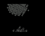
Cutte little intro. I love the dots effect, keep going this way! The last portion of bubble effect when they start to look like they were transparent was awesome too. The objects and the balls from the last screens somehow don't work for me as I'm not a fond of in-your-face type of effects with no depth. But that could just be my twisted taste :)
comment by ilium on 13 August 2019
no comment was added
Please log in to add a comment!
User Votes: Average: 3.75 points (4 votes) |
Please log in to vote on this production!
|