





















comment by skan on 20 February 2011
Neat fx! Massive kindness!!!
comment by z5 on 20 February 2011
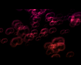
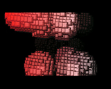
I have watched this demo quite often since it was released and i find it rather fantastic. The fact that you managed to make a demo that looks good without any "real" graphics is a testemony of how good, enjoyable and nicely presented the effects are. I like the color gradients in most scenes and the cloud effect in the beginning is beautiful. I love that part. The "norwegian kindness" part was great too and the cubes. Actually, there wasn't a bad part in this demo.
The tune is great and different but it didn't need that much singing. The chanting is great though. The most powerful moments in the tune are the ones without the singing (the opening scene for example and the part during the cubes).
The real star and the thing that makes it work so well for me is the sync with the music: camera cuts, acceleration, deceleration, color flashing and some other effects. It's quite subtle but feels very natural and well thought out.
Could it have been even better with graphics? Perhaps but it doesn't matter in this case. It is inconsistent & awesome and i surely hope there will be more amiga demo activity from Slummy in the future.
comment by z5 on 20 February 2011
And for the vote, i'd give it a 4.4 at the moment.
comment by z5 on 20 February 2011
And to conclude, i'd say the demo is nicely designed. Not in pure graphics and overlays because there aren't any but in the way the effects are presented and synced. Which i consider part of demo design.
comment by dodge on 21 February 2011
OOOOhhhhhheeeeeeeøøøøøøørrrrghhhhhhoooooooooOOOOOOEeeeeeeee ...
fantastic show
comment by Crumb on 21 February 2011
beautiful... makes you want some more...
comment by Frog on 25 February 2011
Great visual and atmosphere, well polished up
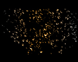
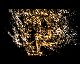
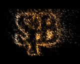
Screenshot 19-22 reminds me some effects on PC, good to see some new kind of effect on miggy !
comment by dodke on 03 March 2011
The 2bpl colour map trick is executed rather badly unfortunately. Having a consistent white point (e.g. white) in the palette would help tremendously in hiding the dithering. Also the map itself could be something more than a horizontal or a vertical gradient as it isn't much more interesting than something you could have done with copper instead. A new palette every 4 scanlines might have even looked much better.
comment by rloaderro on 03 March 2011
A funny detail is that both me and Slummy did the same trick without telling eachother up front (at least not while being in a state where it can be remembered). In swmtfo there is a 3-bpl animated and dithered colour map. It is also social media friendly because you can edit the shape of the colour map in files data/gradient(1234).iff .. afterwards you can share the result on facebook. I tried with radial and linear gradients, but didn't experiment all that much with it.
comment by z5 on 04 March 2011
Good to see that the amiga demoscene is keeping up with modern trends in the form of "social media friendly effects" :)
comment by dalton on 17 March 2011
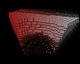
Strings of cubes scene is my favourite in this demo. Really nice camera-movement with changes in speed.
Smoke looks great too, and the final particle effect.
I really like the music, allthough it's a bit weird. I picture in my head some kind of native-american in lusekofta making those sounds...
comment by z5 on 19 October 2011
I'm rewatching this quite often and it remains really enjoyable to watch. Will probably end 2nd in my personal demo of the year list.
I hope we'll see something new demowise from Slummy again next year.
comment by skan on 06 November 2011
@z5
...or maybe even earlier? ;)
comment by bonkers on 21 December 2011
Really well executed demo, excellent soundtrack and well fitting effects. Love the "iso-surface" effect, neat rendering that makes it all look different from the standard "meta-blobs env-mapped things". The last particle effect is also stellar. Combine this with excellent timing and sync and you have a winner that feels really finished as a product.
comment by z5 on 11 February 2013
Up goes my vote. Hasn't lost any of it's appeal after a lot of rewatching.
Please log in to add a comment!
User Votes: Average: 4.12 points (17 votes) |
Please log in to vote on this production!
|