comment by z5 on 18 August 2008
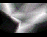
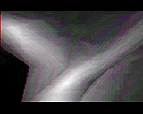
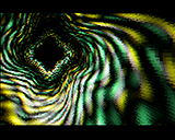
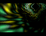
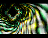
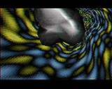
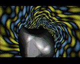
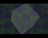
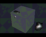
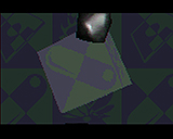
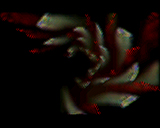
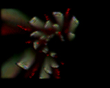
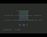
Loved the two color icons and font used. The effect in screen 13 and 14 looks nice. Other than that, texture and color choice seemed a bit hard on the eyes, especially the grey. Nice tune though.
comment by rloaderror on 25 August 2008
I keep coming back to this even if it might not be the best tbl prod. Highlights are music and the "design screens". also a bit cute with a z-buffered tunnel.
comment by klipper on 11 September 2008
this one had "the magic". there's not much there but what there is is executed very well. i've watched this many times and still can't figure out what makes it so appealing.
comment by corial on 10 October 2009
Super sexy intro - I just love that soundtrack!!
Please log in to add a comment!
User Votes: Average: 3.67 points (6 votes) |
Please log in to vote on this production!
|