



















comment by z5 on 25 February 2008
A nice relaxed new demo from Focus Design. I'm surprised at the amount of design that went into this production, since there is no real graphician taking part (both Optima and Corial are "mainly" coders).
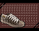
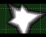
I'm a sucker for smooth transitions and this demo has plenty of those. The tune is enjoyable and fits the style, the effects are nicely executed. I really like the blue with the black outlined white fonts and the dark green with white (screen 16-17). The arrows in screen 4-5 lack something (maybe a black outline + white arrow would have been better?). Color chioce is excellent in some scenes but could have done with a bit more punch in for example the "walking spring" scene.
All in all, a really enjoyable demo.
comment by malmix on 26 February 2008
Nice surprise! Pretty good design and a fine piece of music. I wonder what the system reqs are..?
comment by corial on 26 February 2008
System reqs? Well, everything was made on an emulator, and none of us have tried it on real hardware. The demo is based on the same components as Leisner, and that one seemed to run fine on a real 060 machine.
comment by dodge on 26 February 2008
That -Leisner- seemed a little unstable on my 1260. Let's see tonight what she will say to this one. Nevertheless it's going to be quite a design cutie :)
comment by rloaderror on 26 February 2008
A cute one. I'd like to see it on a real miggy.. Are those circles based on line segments or do you have a routine which draws perspective circles?
comment by corial on 27 February 2008
@load: the circles are just line segments
comment by skan on 27 February 2008
on real hw it's quite...fresh! ;D
some slow-downs on scrolling elements only (which is a crime on Miggy, use that bloody blitter goddammit! ;) , but a nice prod nonetheless. 3/5!
comment by dodge on 27 February 2008
yes, it runs in very pleasing frame rate on the 060. A pretty well designed dentro :)
comment by StingRay on 27 February 2008
No real effects but quite a slick demo anyway. Nice graphics and design and Mice's tune fits perfectly.
comment by z5 on 27 February 2008
@StingRay: out of curiosity, what do you mean by "real effects" (serious question because i see plenty of effects here)?
comment by StingRay on 28 February 2008
z5: by "real effects" I mean something else than plain 3d stuff. No "real effects" might be misleading, so what I wanted to say is that while the demo is nice I miss some effects other than 3d stuff. And yes, I do know it's hard to come up with these nowadays! :) I consider this as a "more design than code" demo. :)
comment by bonkers on 29 February 2008
Neat demo, pleasant music and stylish visuals. Good work.
comment by klipper on 01 March 2008
clean design and enjoyable.
comment by Frog on 01 March 2008
A demo with a refreshing and coherant design. What a pleasure to see a new demo amiga.
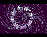
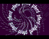
If the effects are not necessarily new (screenshot 18-21 is excellent), this demo has a class that is found in the demos of the past.
Great music.
comment by corial on 01 March 2008
I'm glad that some people actually like this. At the Oxyron party Optima and I discussed postponing or even cancelling the project completely just before submitting it to the compo. I didn't really feel that the demo had turned out the way I wanted it to, and the design as a whole is not really what we had in mind either. Maybe I was just too fed up linking the demo at that time, and maybe I'll check it out again in a couple of weeks. Right now looking at the screenshots is quite sufficient for me!
Please log in to add a comment!
User Votes: Average: 3 points (14 votes) |
Please log in to vote on this production!
|