






















comment by z5 on 30 July 2007
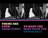
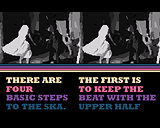
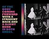
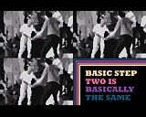
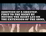
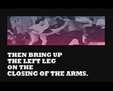
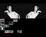
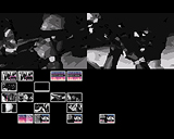
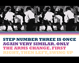
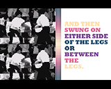
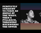
Wow! I love this one. Ofcourse, the screenshots don't do it justice at all. You have to see it moving. Great fresh idea (as usual with uprough), good execution, two fantastic tunes and great color choice for this kind of demos. I would have loved to see slightly less vector graphics and a bit more of that yummy own made graphics and effects, but i'm not complaining :o)
Great to see a new Uprough demo!
comment by xeron on 05 August 2007
I thought it was boring. Its just text and vectorised video. Sorry Up Rough, I like you guys, and most of your prods, but this one did nothing for me.
comment by xeron on 06 August 2007
well, thats a bit harsh. i like the idea and the design. i think it just needs a little bit more variety.
comment by extralife on 09 October 2008
haha the crazy up rough posse', really brings a smile to my face here :)
I love your style, I like your moves.........
comment by mailman on 01 May 2009
Fresh idea but you don't see nothing apart from vectorised video and text. Nice tunes.
Please log in to add a comment!
User Votes: Average: 3.27 points (11 votes) |
Please log in to vote on this production!
|