










comment by z5 on 16 April 2007
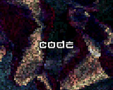
Hmm... at first i didn't think much about this production but after watching it a few times, i think this actually could have been good stuff. The tune is not my cup of tea but nice as it serves its purpose well. I actually like the visual look of this demo, especially the pixelled/blocky (don't know the exact word for it) look as seen in screen 11 for example (in fact, the credits/greet part looks great imo).
However, even for being a short demo, there just isn't enough content to keep the interest going, even for this type of demo. A missed opportunity. It would be great if Optima continued working on this idea.
comment by corial on 17 April 2007
I may not be completely objective here, but I truly like the demo. It's a technodemo! Not some much mumbojumbo, just pounding music and some raw-looking effects. The effects are using 4096 colours and Optima spent much time on the making the weird mosaic look-alike filter. I also think that the creditspart is my favourite effect.
comment by Toffeeman on 01 May 2007
Only seen the video of this demo but I like it. How well does it run on a stock 1200 ? It's hard to judge how good the code is without knowing the machine it was running on in the video.
comment by noname on 24 May 2007
I'll spare you the group vote but I think this demo was a nice surprise and very well executed. Spot on!
comment by britelite on 25 May 2007
It's okayish, but seriously lacks content and runs in a way too shitty resolution.
comment by optima on 17 September 2007
I wanted to do something different than my usual classy mature pr0n this time. A lightweight and unpretentious demo with a good pace driven by a hard track. Agreed, it is a bit lacking on the production side, but that's what you get when finishing demos at parties :) I will for sure use the mosaic-render again coz I just love the raw look it gives. - and I'll also release a fixed version where the timing scheeme doesn't fuck up on real HW..
comment by dodke on 28 August 2008
the content seems fine but if you're doing copperchunky you should at least go for the maximum possible resolution (3x3) since even that is very little but looks somewhat decent when used with full resolution overlays. I guess it was put together in quite a hurry but even with the content it has it could be a lot more interesting if the effects would change less frequently and the scenes themselves had some sync to the music. Now it just feels like the parts are chosen more or less randomly and they don't really seem to connect with the music at all.
Please log in to add a comment!
User Votes: Average: 2.65 points (17 votes) |
Please log in to vote on this production!
|