





comment by z5 on 11 April 2007
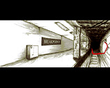
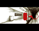
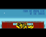
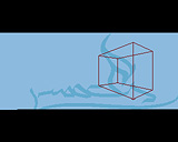
I really like the look of this one. Moods Plateau may not have the groundbraking killer effects from some other productions, but they sure than make up with fresh ideas. Really liked the "sketch" look. In fact, the whole train/station scene looks damn good. The only thing i wasn't too sure about was the square moving up and overlaying in the first scene (screen 4 but the squares aren't there yet). It would have looked good without it (like in the screenshot).
Keep going guys! Nice intro!
comment by xeron on 11 April 2007
I like some of the design, and i like the 3d red blob in the tube station, but on the whole this intro did absolutely nothing for me at all.
comment by sp on 13 April 2007
the download link points to another file.
comment by dodge on 13 April 2007
uhm...and the chipset is not AGA.
Thx in advance for fixing both the link and chipset info
comment by z5 on 13 April 2007
@dodge: fixed now.
comment by bonkers on 30 April 2007
I really enjoyed this intro on the bigscreen. The design is good and the music I find excellent. There seems to be a continous progress in the coding department at Moods which is great to see.
comment by malmix on 04 March 2008
I'm totally with bonkers on this one
Please log in to add a comment!
User Votes: Average: 2.6 points (10 votes) |
Please log in to vote on this production!
|