


comment by z5 on 20 April 2006
Kalms really shouldn't have written that thing about graphicians being overrated :) Honestly, this is not TBL's best demo. It lacks a lot in the graphics/textures department. The demo began really impressive though: the credit part is well done. But after that, it didn't convince. The greetings part was rather nice aswell. The music was, as always the case with Blaizer, fantastic (yes yes, i'm fan of olof).
May have been technically great (how should i know :)), but it didn't impress.
comment by noname on 20 April 2006
Charming unfinished production just like Roots/Sanity back then. Give us Requiem 2.0 at some coming party.
comment by mailman on 20 April 2006
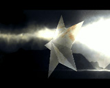
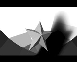
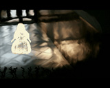
After the previous Brekapoint I said that TBL didn't deserve to win (it should be Loonies). This year it was shown why. Is there somekind of engine or demo generator created by Kalms? The demo looks like it has been used some template. Not so many effects used in this one. Interesting is the star's shadow (is it realtime?). Interesting is also the smoke effect (greetings) and foggy forest but it is not much for such huge production. The best in whole is music. I guess it is multichanneled module with some great orchestral, movie motives. It is awesome and suits well to the rest. But as it could be seen the audience at Breakpoint did not fall for for the second time. I think this was deserved 3rd place. Oh, the demo is worth to be watched till the end.
comment by z5 on 20 April 2006
On a sidenote, i really expected TBL to come up with a stunner this time more so than other years because Kalms mentioned more hardcore coding for their next demo. I was kind of expecting a lot more effects (stuff similar to the greetings part in Ocean Machine) than real 3D scenes/landscapes. I guess next year i shouldn't hope so much... and all will be fine again. Also, TBL nearly always does a final version so i'm curious what it will look like and it will be much changed.
comment by Kalms on 20 April 2006
mailman: we do have a demosystem, but that is more like a set of support libraries. You're probably thinking of the fact that the flow of the demo is rather simplistic - N seconds of one effect, then M seconds of the next, etc. That's rather due to lack of time for adding sync to the demo.
The music is a 22kHz 16bit stero WAV track (which has subsequently been compressed with a lossy compressor).
z5: We're probably not going to do any final version of this demo -- there's too much that we would like to change to really make it worth the time.
comment by xeron on 20 April 2006
@Kalms
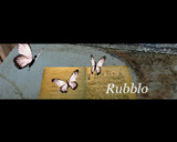
I enjoyed it a lot, but it really does feel very unfinished! Hope you'll be back on form next year. The beginning part with the butterflies is amazing!
comment by z5 on 21 April 2006
@Kalms:
Thanks a lot for the feedback. Indeed, that thought crossed my mind (about the final version). Hope this will motivate you to crush them all next year :)
Is there a link to the music? I would love to get my hands on that tune.
comment by corial on 22 April 2006
Very good music and some very good effects here and there. The fire-credits-part truly rules.
comment by rloaderro on 23 April 2006
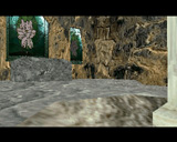
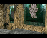
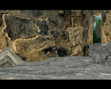
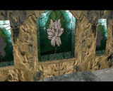
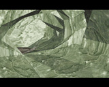
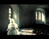
before I watch it again. I liked the forest scene at the end. I didn't like the high speed pacing of the forest run though.. the churchish scene needs some baked radiosity lighting. also it hasn't got a uniform colour., too much contrast between the floor and the walls.. look at global ambient lighting in movies too see what it should be like(in the matrix, there is always some tint of green for example). the cave is way too bright for a cave. it is almost white.. the leaves are hard green whil e the backdrop is sundown coloured. wtf. no leaves are hard green at sundown :)
the opening intro is pretty cool, but the butterflies are purple!!!.. make it all brown/orange or somethign. for that old ancient feeling.. I think...
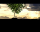
I'm eager to watch the star/bloom effect again.it looks smooth in the screenshots :)
comment by rloaderro on 25 April 2006
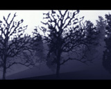
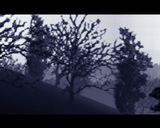
Oki watched it again. It is quite cool. The bloom effect looked great and I wonder how it is done to avoid the gridexpander artefacts that I'm having. I also realized the pace in the forest wasn't as high as I remembered it to be. I thought the forest looked great even if the textures could have been more hires. The soft shadow thingy was cool too even if I don't quite realize what the effect is. I'm not sure if the background is lit from the same lightsource as the star.. anyways :) NIce to see some of the image based rendering you have been looking to implement for a few years now too.. The effect when the butterflies melt into the book is nice.
The woman/wiggly line parts are horrible though.. The lines look like the abomination from the vault of deluxe paint. Who knows, maybe this is deluxe paint 6 like some amiga people demanded from EA a while ago. Some more colour consistency throughout would help loads on the overall look.
comment by mailman on 25 April 2006
I might be wrong but watching the demo three times I had a feeling that those woman/wiggly lines are drawn random.
comment by mailman on 25 April 2006
There is a video available (if anyone is interested) - http://www.4players.de/4sceners.php/download_info/-/videos/828.html
comment by skan on 26 April 2006
First time i watched it, i was shocked. Then i felt puzzeld, then disappointed... in the end, i must admit this is a good demo after all (after all = lack of "real graphician", but also fast-made stuff).
I agree with Loady, there's plenty of room for improvements ( darker cave for instance, it would r00l with some dark pre-bumpmapping-rendered textures ;) ), but i like the random black tentacles thingie. Best parts are greetings and woods fly-by, imho.
A message for master Kalms: think twice about a final release please... you deserve it, WE deserve it! ;) AND ME WANTS IT!!!! ;D
comment by KAM_ on 30 April 2006
Forrest scene looks great, but the rest is rather average...
comment by bonkers on 20 June 2006
I'm really glad that TBL decided to do this demo, after winning the MS/BP demo compo since 2001 they've built up quite a lot of expectations around their demos. With expectations comes pressure and that can very easily take away the fun in anything. So even when Louie decides that he doesn't want to be involved they decided to make a demo because they still see the fun in it, and I'm really happy they did as the scene is supposed to be just for fun.
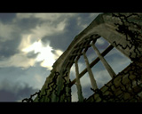
From a coders point of view this demo is really good, the two scenes with the star are really cool, and I love the forest scene. What differs this demo from the TBL demos from previous years is the design/graphics, for example the overlay on screen 17 (the arc) have very visible artifacts around the boundary which makes the scene look odd. The choice of colour/texture in the Cave scene could also have been better. The music also deserves to be mentioned, fast paced and very fitting.
Please log in to add a comment!
User Votes: Average: 3.56 points (25 votes) |
Please log in to vote on this production!
|