












comment by z5 on 05 November 2005
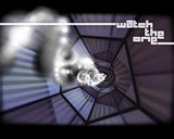
Some info: this demo is actually called: #one: Geometry but due to technical reasons (screenshots having the same name as demo), i had to add it here as one geometry. Furthermore, i don't think it actually was released at a competition but it was released at l'Alchimie, which is a Amiga party in France.
And now the most important part: the high quality video is available here:
http://uniweb.free.fr/one-part1
http://uniweb.free.fr/one-part2
Just download both archives and use Winrar to extract the first one. Winrar will automatically join both archives into one avi again.
comment by mailman on 05 November 2005
Demo is rather average. Far more better than Zero but it is still just a few effects in a row. I wish that Crisot think about some design in the future productions. This demo could be much better if properly used with those stylish, classic movie frames. The flight of those fighters also could be better handled. I like very much greetings part. Great work on that matter. All in all, One is better than Zero and it is obvious that Crisot is doing also better with coding. I hope that his next production will be more unpredictible, more filled with design and less with those stupid idea "who will beat fifteen billions polygons in a one frame"...
comment by AGAfaster on 05 November 2005
@mailman, well I liked it ! mebbe one of us doesnt see enough demos,
but then we dont get enough on the A1 platform. if there was just
one uA1 in a shop window somewhere with that playing, it would be a
start.
more, please ! lets see some more crews getting in on the act !!
comment by mailman on 06 November 2005
@AGAfaster<br><br>
I am not saying I don't like it. I just said that it is average in whole. Just because it is the second production for A1 or production for G3/G4 it doesn't say that it has to get 5/5 and be flawless. Like I wrote - Crisot could have worked on it a bit more and it could be really, really nice production. Nevertheless watching progress which Cristot is doing I dare to say that his third demo might be really awesome. And I count on it.
comment by z5 on 06 November 2005
Hmm... watched it quite a few times already and enjoying it. But i can see what Mailman is saying here. First of all, the music isn't too hot. I read somewhere that this was done in quite a hurry. Still, after putting in so much work in the demo, it deserved a better tune. Music is what drives a demo in most cases.
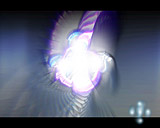
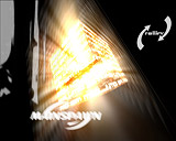
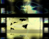
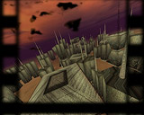
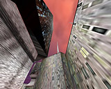
Color choice is questionnable in some scenes (screen 9,10,11 and 13 in particular) and i have the feeling that a bit too much blur/smear was used in some scenes. The 3D scenes weren't really necessary for me and didn't look that good. I certainly enjoyed the first part of the demo the most.
I think it lacks, as mailman said, something in the design/graphics department. It's a showcase of effects, and very nice and decent effects, but it's nothing more. Some (minimal) graphics here and there (or a fullscreen picture with a decent wipe effect) could have done wonders imo.
There is no doubt in my mind that Crisot is a very good coder. Someone who still takes pride in how fast and smooth his routines work. I just have the feeling that Universe should take onboard a musician (or spend more time on the music themselves) and an extra graphician/3D modeller. I have no doubt that Universe have the ability to make some really stunning demos. This was a step forwards and it is a good demo, which could have been stunning.
My favourite parts: the first 8 screens, screenshot 11 and 12 (the cube effect in 12 looks fab) and screens 20 and 21 (the last effect, screen 21, looks great). The demo is smooth and fast and has great dynamics. I'm hesitating between a 3 and 4/5 here.
comment by DJBase on 06 November 2005
I watched the video. It is not bad and of course a lot faster than the old amiga demos on 68k/ppc hardware but the soundtrack doesnt really fit.
comment by mailman on 07 November 2005
@z5
You got my point and I have nothing to add to it. Not to be so criticial I forgot to mention that next to greetings part I am pretty keen on the torus thing (screenshot 11) and that face coming out from the rock (screenshot 20). I hope Crisot will get our notices as a lesson and his next production will be really piece art.
comment by scicco on 07 November 2005
i agree with mailman & z5.
comment by crisot on 08 November 2005
Hi! 1, or 2, or more comments ;) First, thanks for all yours posts and suggestions. I read them and don't forget them.
So, about some problems everybody notice: The music. The music on the demo is not the original music. Mainspawn done another music but had no time to finish it before the party (work, work, work...) so, 20 hours before the deadline, I had to write a music in less than 1 hour on my korg. That's why the music suxx and is not appropriated. BTW: Correct this: Music == Crisot, not Mainspawn, so ;)
About the "too much motion blur", this problem is video related: The motion blur is not a real motion blur: More framerate you have, less motion blur you see: Since the video is very slow == 30 fps, there is a lot of motion blur. On an AmigaOne, the blured effects runs at more than 50 fps and are less blured! And they looks much better.
In fact this demo in unfinished: Working on it made me progressing a lot in W3D rendering: Everytime I started a new effect, it was looking much better than the old one. So, in less than a month, I hated this demo ;) That's why I released this "crap" version: Actually, only 1/3 or 1/2 of the ideas on the paper where used in the demo.
This demo is like a draft, and we released it to restart much better on another one. #Two ;) But I got no time to start it before a while :-/
Thank you for reading my lame english.
comment by scicco on 08 November 2005
@crisot:
thanks for your comment, it helps to understand lots of questions. :)
anyway i'm sure that even if you think your effects looked kinda lame they would look very good with a bit more styled motions and objects/textures/colors. ah well...i really know that problem if you feel kinda sick by watching the same effect again and again. i understand this. :)
about the motion blur: you should redesign your blur code then, to make it independent of render speed. that keeps some blur in the future with hardware running the demo in 1000 fps.. ;)
anyway i look forward to #two...and take your time for the music and design. i'm sure it'll be a nice one then! :)
comment by xeron on 08 November 2005
The music is weak, understandibly so. But I really enjoyed this!
comment by jay on 10 November 2005
What a great speedy demo! I love this one. The music is not the best part of this prod but the visual can help to forgot that ;)
comment by KAM_ on 27 November 2005
Shit, I don't have WinRAR, in fact - I don't have Windows! Ergo - I can't watch the video. Really nice.
comment by SKOLMAN_MWS on 28 November 2005
http://media.putfile.com/UNIVERSE_ONE-DivX
comment by danthy on 26 February 2006
Not bad at all.
Please log in to add a comment!
User Votes: Average: 3.85 points (13 votes) |
Please log in to vote on this production!
|