

comment by un0 on 18 April 2004
wow, after quitting all scene activities as a more or less lame trader/swapper almost 9 years ago, i now get the opportunity to comment on one of the most stunning demos ever, ok, here we go: all eph productions blew me away, but this one totally shocked me! i`ve never experienced such an intense atmosphere, i can`t even find words to describe this amazing work. coding, visuals and audio just fit together perfectly and it all just leaves me absolutely amazed (and disturbed, wtf is going on here?!?). ephidrena, you simply rule them all!
comment by KAM_ on 19 April 2004
dude, are You mad?... ;]
comment by rloaderror on 19 April 2004
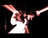
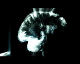
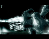
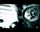
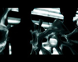
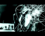
Ill give you some background info on this one.. The pictures are actually taken in an autopsy lab which a friend of mine had visited doing a medicine course. I thought the gory details would make cool demopics and shot away at people cut into slices, whale-hearts, strange multisexed plastic figures, livers, brains, veins. The most gory pictures were left out of the demo or disguised using high contrasts. We didnt want to do a bloody dimmu borgir demo either.
comment by chainq on 19 April 2004
Ephidrena showed again, why they are among my all-time favourites. Kickass.
comment by albolone on 19 April 2004
Shit ... had to leave BP04 before the (very delayed) amiga demo competition. and I'm regretting it now big time. I'm surprised and superpleased about the number and quality of the amiga entries! Would have loved to experience 'em all on the big screen! just seeing the pictures of this ephidrena piece now gives me the chills! And I'm dying to see a divx-video ... please, make it happen asap. thanks, guys!
comment by Ghandy on 19 April 2004
Saw the poor Ephidrena guys working under the heater at the partyplace and I can only say: Awesome stuff you've put together! Ephidrena - the heat goes on ;-)
comment by jPV on 19 April 2004
But I still like Concrete's style most ;)
comment by kempy on 19 April 2004
great work guys! this one replaced "j" on my personal "best demo" chart...
comment by z5 on 20 April 2004
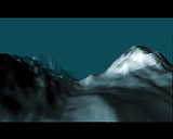
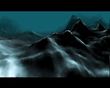
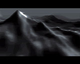
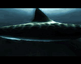
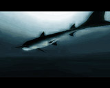
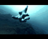
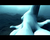
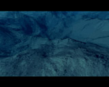
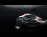
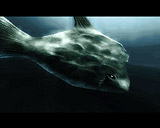
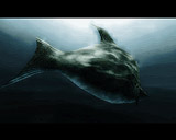
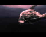
ok, here goes my mini-review: excellent soundtrack which sets the mood perfectly for a really dark demo. The shark and fish scene totally rule. I just love the effect used on the shark: difficult to describe what it is, but it makes the white look really dirty and realistic (some kind of blur...). Mountain scenes are cool, "cog wheel"-alike scene is fab too. The visual quality of this demo is so unique and brilliant. Like the fading to red on the mountain top view and the fish scene. Great textures on the shark and fish.
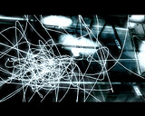
Some points that i noticed: the exploding pixels transition between mountain scene and shark scene is cool but not really fitting (looks a bit lost and too cute). And there is one thing i don't understand: the use of shiny light grey/white effects (screenshot 10,16,17) on top of already very shiny and white places in the background. This is made even worse by adding extra lightning on these places in the background. A bit too much overkill there.
Visually, probably the most interesting Ephidrena demo yet. Ephidrena have been my favourite group since a long time and they just keep on getting better and better. Every demo is a new experience (despite of the re-use of a lot of effects from previous demos). I think i would have voted this first place at Breakpoint. I keep my fingers crossed that Ephidrena will release another demo this year.
By the way, what happened to your 4k intro at Breakpoint?
comment by KAM_ on 20 April 2004
the demo is good. design is very nice, atmosphere is fine, music is strange but interesting. but... it is not THAT Ephidrena i like. My favourites from eph are: "Adam...", "Jane..." and "J". I just love that style. And I'm still waiting for some similar demos. Or maybe it is just an evolution?...
All in all - things are better than year ago. ;]
comment by z5 on 20 April 2004
After rewatching it a couple of times, i take back the thing about the exploding pixels transition type of thingie. For ultimate viewing pleasure: make the room completely dark and turn up the music volume. For me, this is one of the most intense demo experiences ever. And that is what it is all about. Shoots straight into my alltime favourite demos.
comment by un0 on 20 April 2004
KAM_, do you mean mad about true art? yep, then i agree ;-) there are dozens and dozens of fantastic productions, and there are a handfull of prods that totally changed my view on the scene e.g. state of the art, 3ddemoII, motion-originII, 1000%... and now it`s 'respirator stories'. after 'fels' i wondered if eph could ever top that and i wondered if eph would be able to switch their style again and if yes, in which direction they would go... phew, they reinvented their style and they did it better than ever!
comment by z5 on 20 April 2004
@un0:
well said :) I totally agree ;)
comment by rloaderror on 21 April 2004
The effect used on the shark (and just about everywhere in this demo) is the infamous glow commonly seen in pc prods nowadays.. This glow-effect also glows to darkness so its more of a luminance-smearing effect.. White/black bleeds onto neighbouring pixels.. It helps make the image more dirty. One drawback of this effect is that it is fullscreen only.. I wanted to limit the lightsmearing to only selected objects, but for some reason it didnt work (partycoding rocks) that way. This makes it look kind of messy in parts..
The splinter to squares effect is a bit misplaced in this demo.. An idea would be to blow up the screen into irregular shapes with the same dimension as the squares to make it look more like shattering glass or something. The way it is now, it looks like it is a leftover from Sumolysbryter ;) Still I thought it kind of added to the fun of watching the demo when it was timed to the cymbal just before the "shark takeoff". :)
The camera moves of just 10,16,17 were done 30 minutes before deadline, and so they dont really fit with the backgrounds or anything.. The line-effect would probably be better on a black background in the sfumato style. It is a bit messy.. argh..
We'll see if there will be a final version.. There are just so many things that could be better.. I hate that the shadetables dont blend a bit towards the dominating colour of the palette.. Like, when viewing the shark against the light, lots of greys are picked as shades, but if it had picked slightly blue/greenish colours of the same luminance it would probably look a lot better.. Dont know who to calculate something which is perceptually prettier.. Greys are the natural to pick as a darker shade of white. It just doesnt always look nice.
About the 4k. Well, I made a blunder with some fpu code which resulted in weird behaviour when emulated by the amiga fpu libs, but worked perfectly fine when emulated by oxypatcher. I have oxypatcher in my startup sequence, so I never tested the intro without it (never knew about this problem).. The compo rules stated that only a clean boot and setpatch would be done before starting the intros. This resulted in only an empty screen with music on the bigscreen (argh). The organizers didnt have time/didnt want to show it again, so I had it disqualified instead. It was only 3.8k with no size optimizing, so Ill get in there and shrink it down and add some more to it.. Dont know when Ill release it. Maybe at Assembly or Kindergarden..
I feel like optimus
comment by rloaderror on 21 April 2004
Divx is here
http://www.scene.org/file_dl.php?url=ftp://ftp.scene.org/pub/parties/
2004/breakpoint04/amiga/demo/ephidrena_-_respirator_stories_%28divx_320x240%29.avi&id=240303
Please log in to add a comment!
User Votes: Average: 4.53 points (49 votes) |
Please log in to vote on this production!
|