





comment by Ralph Wiggum on 22 March 2004
Some scenes are nice, others are not. The colours and design are okay but the music is boring. This demo is worth a look but it´s not my taste.
comment by rloaderror on 23 March 2004
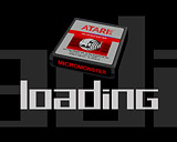
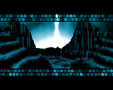
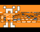
Best Contraz demo to date.. The theme is about old games I guess which it borrows a lot of elements from. Not strikingly original, but pulled of nicely with lots of small details that you dont pay attention to the first time you see it. The pacman eating the screen is cool. I also like the way the micromonster logo enters the screen.. The greets scroller is a cool idea.. the two spheres in the tunnel are also rather sexy.
The "nostalgia" scene sucks a bit. It looks a bit c64 though, and I guess that was the intention. BUT ITS A BIT UGLY.. ;)
The music is a bit too organic when compared to the content. I guess some closer cooperation between the musician and the coder would have been teh shit to do.
Electro music on this one would have been great :)
comment by KAM_ on 24 March 2004
well made production. effects are not very original, but design is quite kewl. or even better! all in all - stylish and interesting demo, better check this out! :)
unfortunately, works slow on 040/40...
comment by wayne on 26 March 2004
Nice one from CONTRAZ typical productions.
comment by Frequent on 04 April 2004
Puzzles me, that it did'nt get any betther rank in the compo. We can only fear that retrocomputing is a non-existing topic for the visitors at Tg in these days....(Fear, Fear!).
comment by ToAks on 23 May 2004
i really enjoyed this demo! , weird how it didnt manage to get more votes..
HAIL! to my friends in contrzzzzzzzzzzzzzzzz
comment by DeXXo on 26 May 2004
Nice and entertaining demo with a twist of cool music. Love the "micromonsters" concept behind it, but I can't believe that it was ranked 15th. Bah to the voters. :P
comment by corial on 26 September 2005
There are some very good effects like the jumping bump-balls, and I like most of the design.
comment by jack-3d on 17 January 2012
I love the GFX and design, also music works there ;o)
comment by z5 on 17 January 2012
Nice demo indeed. Dran has an eye for design and attention to detail. It seems he has put some real thought into making this. Transitions between effects are nice too. Graphics are generally great and the effects are enjoyable. Enjoyed the intro credits scene a lot. Greetings scroller was great but somewhat unreadable for me.
I tend to agree with Loaderror though in that the music, while nice, felt somewhat disconnected.
Please log in to add a comment!
User Votes: Average: 3.79 points (28 votes) |
Please log in to vote on this production!
|