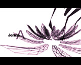
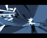
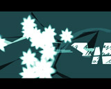
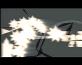
comment by z5 on 09 November 2003
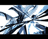
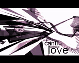
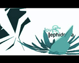
As i understood it, this was a fast made production. And it shows, as the effects are probably all seen before in some other eph release. By the way, the star effect (screen 3+4) remind me of an effect seen in Spaceballs Powergod. Still, i like the phat bass sound and the effect in synchro with that sound. The effect where the screen is moved to the right and takes on a different color. Looks really cool.
By the way, who is Jenna? And while we are at it, who are Janne Ahonen and Adam Malysz? Are these some Norwegian local superheros in the pub you frequently visit, or are they members of a Norwegian boysband we all should have cd's from? Or are they really famous and am i making a complete fool of myself at this very moment?
comment by DeXXo on 09 November 2003
hehe... Janne Ahonen & Adam Malysz are two of the best ski jumpers around. Can't wait for the new season to start! Go sLOVEnia!
comment by DeXXo on 09 November 2003
But i don't know who' s Jenna. Maybe Jenna Jameson? ;)
comment by rloaderror on 20 December 2003
its jenna jameson yes. :) I was really tired when I came up with that name.. This production is very rushed. The coolest part about it is that we made the music in the 4k sound engine which was extended with sample support for this occasion. It did some wonders on the drum loop which sounded rather flat in protracker.
The music was made the year before and was called something like "arcane sleeps". me and cheetah wanted to do a quick prod before he went to africa for a year, but we didnt manage to finish it in time and so the tune was held back a while.
comment by ToAks on 23 May 2004
this was a let down..., small in size shows why as its small in innovation and design and code too , oh and the music too :-) , anyway its fairly enjoyable but i know ephidrena can do better than this!..
comment by KAM_ on 12 August 2004
so little, so nice.
comment by skipp604 on 08 November 2008
The music simply r0xx, and I really enjoyed the minimalistic/monochromatic design. Not everything has to be 18bit eye-candy. It's small and neat, the way I see it :)
comment by z5 on 13 January 2012
Watching it now, i like it quite a bit, especially the design and colors. Rather minimalistic (as skipp604 pointed out) but works well. The background in screen 1, 2, 3 and 7 is great but gets a bit too crowded in 5 and 6 (with the photo intermixed). Colors and effects are nice too and good synchro. A bit short and potential not fully realised but good.
Please log in to add a comment!
User Votes: Average: 3.44 points (18 votes) |
Please log in to vote on this production!
|