




comment by KAM_ on 09 October 2003
the demo idea (blue desing) is good. but demo is quite poor. bad design, boring effects, gray music. nothing special.
comment by rloaderror on 20 November 2003
this has a lot of potential.. some cool effects, design(in the scene sense that "design is when you put stuff on top of the effects") and music.. oh well.. Sounds like Puryx made the part with the "takeoff" chords in the party hall with lots of noise around him. The blue is a bit too cyan for my taste, but thats just nitpicking. The composition of the design elements is not bad, but a little boring maybe. Concentrate the detail around one area and use large empty areas around this area to balance the picture instead. If you can compose in such a way that the watcher gets some sense of perspective, then thats a good thing..
The voxel routine is really great. Fast interpolated voxels arent common in the amiga scene.
I wish it had more contrast in the colours though. The voxel is veery bright and the background is entirely black.I wish the voxel had some more of the dark range in it aswell.dunno.
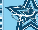
Also a tip to Scicco the next time he scales dpaint graphics down (for example the stars in the background). Blur it once or twice using the smooth function first and then downscale the blurred version.. Somewhat akin to multisampling and you get an antialiasing effect.. This is also a good tip if you want to draw some text on amiga where there are no antialiased fonts. Draw in twice the resolution, blur and scale down.. yoohoo. much better :)
comment by scicco on 21 November 2003
wow, loady. thanks for all the words. :)
we'll try to improve our design skills, which is not easy as we are not talented as you in eph are. :) but we'll give our best. hope to be able to talk to you at some party place about all that stuff soon.
yes, the voxel is great, stingray did it, he hardcoreoptimized it. :)
and thanks for the anitalias-fake-thing, helps me a lot! very constructive words, thanks again! :)
comment by z5 on 21 November 2003
Definately the demo i have enjoyed the most from Scarab so far. Whereas previous demos were more collections of effects without any general theme and without any design, this is actually the opposite: a general theme/color and first signs of attention to design.
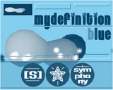
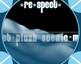
The demo is a bit rough around the edges though. And with rough around the edges, i mean it like i write it. I have the impression that a lot of graphics/fonts were smoothed against a particular background. This is good, if the background is indeed used. I noticed this in the fonts and for example also in screenshot 3, where the edges of the 2 blue circles (with the arrow in it) were probably smoothed against a white backdrop. But when the blueish circles move in the back of them circles, you can clearly see the smoothed edges. And indeed, the small circles and stars in screenshot 2 look really rough. In general, the demo looks really low-res.
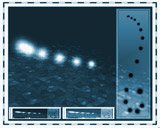
Still, i must say that i enjoyed this demo. The voxel looks great, and i really like the last two scenes (screenshot 8 and 9), allthough i have the feeling that they overdid the design element in the last scene a bit (the two small windows in the bottom were a bit too much).
Really looking forward to next Scarab demo :) Keep up the great work!
comment by mailman on 05 June 2004
Two effects I like the most: presented on the last screen and when there are greetings. Nice music but for me, it doesn't fit to the whole rest. The demo is quite boring and at some moment I was having a thought how long is it to an end. So far it is the best work of Scarab.
comment by mailman on 05 June 2004
And one more thing. I have no idea why it happens, but when the demo goes to the end it reboots my Amiga. Two times watched two times happened... I wasn't happy :(
comment by heetach on 20 February 2005
My evil twin cheetah honestly considers this music to be an act of crime against humanity, and as such, those responsible for it should be shot and then strangled. But wait, on second thought it occurs to him that he's actually a pacifist, so he'll modify the punishment to some gentle torture after being covered in tar and feathers.
I think the scarab guys should have some credit anyway, for trying really hard and for being nice people (and way too humble).
comment by skan on 04 March 2005
@rloaderror
Another nice trick to simulate antialias is to scale brushes and fonts down using Personal Paint's "Color Average Resize" option :D
comment by cybernoid on 14 April 2007
Very fast to my Amiga 4000 040. Ill vote when ill buy (someday... hope) a 68060.
Please log in to add a comment!
User Votes: Average: 3 points (17 votes) |
Please log in to vote on this production!
|