
comment by scicco on 14 October 2003
best iris demo yet...maybe a bit too short...
comment by rloaderror on 20 December 2003
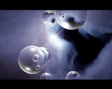
nice reflective spheres.. and certainly the best iris demo so far..
Some nice pixelled pics here also. Birdseye voxel is still a mystery to me, and so is cool :). The bloody danish copying of tbl tree effect mania sadly continues. I would have made an orange inspired sunset here. Generate a skybox in terragen on pc maybe?
I think the gradient (brown to green) which is used in very much in this demo sucks (screen 5,6 and 12). Also the iris logo should have a different texture (less marble like) or colour. Maybe something resembling the sky but with a slightly different hue.
Take a look at movies.. Notice that most scenes are tinted to some kind of colour. Matrix uses some kind of green a lot. The point is that most colours on screen are in one hue or is a variation on one hue. I think thats a good way to go in order to make things look more pro.
comment by DrDoom on 22 December 2003
The birds-eye voxel is reallya simple effect, but I had to figure it out for myself, and so will you. ;)
As for the TBL tree, I didn't actually mean to make a tree. I tried some other scenes, but only the tree looked good. So I ended up doing a tree. And remember, if I had really copied TBL, that would have been an IFF animation, not a 3D scene. Also, the only other Danish production I remember prior to Light II, featuring a tree like that, must have been Loonies' 40k version of Perfect Circle. What's more, TBL hardly invented silhouettes. Next demo will feature even more silhouettes, so beware. :)
The colour scheme, then, well, tinted or biased colour schemes are a really cheap trick, I think. Only thing worse is monochrome effects. I chose clear, strong colours deliberately for the oldschool impression. I was never happy with the intro part, of course.. Oh well, next demo will feature even clearer colours. Prepare for lots of red.. :)
All that being said, I really only spent about a week on this production. There was a third part which didn't make it into the demo cause of the deadline, and a few effects (and lots and lots of design gimmicks) left out from the first two parts. So I think it deserved its third place, even if the second prize went to a PPC demo.. yech..
comment by z5 on 22 December 2003
Wow! I was impressed by this little demo. It seems that Iris finally decided to leave the oldskool behind and create a modern looking demo.
I really love it, especially the second part with fab music and atmosphere. (little) negative points would be too short (meaning that i wanted to see a lot more from this quality), the linking between the two parts could have been done a bit better (with a picture for example) and i wish they used another font!
BUT definately the surprise from Breakpoint. BIG respect to Dr.Doom who not only did the complete code and created some very cool effects, but also for the stunning pixelwork!
@DrDoom:
Really looking forward to the next release!! (Is Ransom still coding?)
comment by xeron on 15 April 2004
Really a very nice demo! Dr. Doom is a very hard working demo coder, and is pretty much keeping IRIS going these days...
comment by skan on 16 April 2004
Cool and stylish. A nice shot.
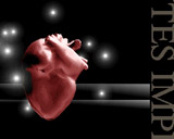
BTW is "HeartCore" the rumored third part with few additions? ;)
comment by ToAks on 23 May 2004
VOXEL ROXXOR!!!!!!!!!!!!
comment by optimus on 18 August 2004
I really have to see this again. The one that converted me into an Iris fan :)
comment by ijs on 11 August 2006
The start of a series of iris demo's that get better each time.. out with the old style... in with the dr. doom style! Good stuff.
Please log in to add a comment!
User Votes: Average: 4.04 points (23 votes) |
Please log in to vote on this production!
|