













comment by corial on 14 April 2009
Another TBL wannabe demo. I respect the hardcore codework, but I don't at all like this kind of pretentious demos.
comment by dalton on 14 April 2009
awesome 3d scenes! but it really suffers from the low framerate
comment by dodge on 14 April 2009
wouldn't say "wannabe" but rather a battle challenge.
I was quite stunned by the glow and other hightech stuff as well as the graphical and musical performance.
comment by dodke on 15 April 2009
Could have been more coherent and faster (although i think the frame rate had improved from the earlier elude productions) and i'm not such a big fan of the polish epic church techno style but all in all really nice work.
comment by extralife on 15 April 2009
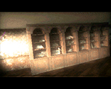
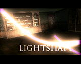
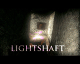
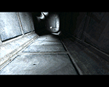
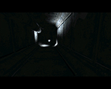
aren't u guys being a little hard on this one, i mean its got some pretty great stuff in here, like the scene where the lightbeam pushes the chair into the hallway and, my favorite scene the discoball kind of effect in the hallway in screen 23-27, this demo is imho a great improvement by elude, yes i agree im allso more a fan of fast framed demo's and it's great to see the amiga is moving back to pushing framerate like the c64, but I still like this demo alot. keep it up Elude, this one is great
comment by chainq on 15 April 2009
Blah, i disagree with the previous comments. This one is great, and really a blink into future, and trying to open new horizons. I mean, i recall demos having trouble pushing 10fps in basic textured worldvectors a decade ago, and now almost everyone's engine can do it in 25fps. Same with voxel stuff, the early ones were doing 8-10 fps, and now look at Blueberry's 4K...
So if you think all the *VERY* neat stuff packed into this baby is too slow, just do it better, make it 25fps, and let everyone and yourself be happy about it. :)
About the design stuff, it feels a bit unfinished, and some parts are visibly put together in a hurry, while the others are extremely well polished. But i like Chaser's music and the general style too. So 4/5 at least, from me.
comment by Sir_Lucas on 16 April 2009
A classic masterpiece. The code, music, gfx are all polished to very high extends. Hope to see more in the future from Elude!!!! Keep up the good work guys, YOU rock my world!!!!!!
comment by klipper on 16 April 2009
corial: seriousely, you sound like an 8 year old child: "I don't like this...nah nah nah!!!!"
Mawi/Elude demos have always had an "artistic air"/seriousness to them. To call this "pretentious" is ridiculous. Kaori and his designers obviously view their work as an artform and not just lighthearted entertainment made to lift Corial's spirits. If you don't like their style, simply do not watch.
This is an alltime classic Amiga demo, and I for one appretiate the immense effort put into this WORK OF ART! Good job Elude. 5/5
comment by klipper on 16 April 2009
Kaori = Kiero, of course ;-)
comment by z5 on 16 April 2009
@klipper: was that really necessary? He just stated his opinion, just like everybody else. Let's keep the spirit friendly please :)
@corial: just out of curiosity, what do you mean by prententious? Why is this demo pretentious compared to other demos?
comment by dodge on 16 April 2009
For me this thing said: "Kalms, Louie, Blaizer! Bring it on, we're ready!"
comment by Toffeeman on 16 April 2009
I understand why he says pretentious but to me it means an epic demo :0)
I really like this style of demo. Great effects and I thought it deserved to win.
Kiero is there any room of optimizing some of the effects to improve the frame rate ? I remember you said your last demo had some parts written in C.
comment by klipper on 17 April 2009
z5: well, where I'm from to call someone's hard work "pretentious" and "wannabe" is extremely rude and insulting. Perhaps the gravity of those words are not apparent to many who speak English as a second language. I'm not sure.
But sure, let's keep things friendly. :-)
comment by Crumb on 17 April 2009
Great music and effects. Most of TBL demos mix different elements (sometimes recycled) that have little in common between them so I don't think TBL demos are more "coherent" in their themes.
Now let's comment the scenes so they can make improvements:
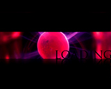
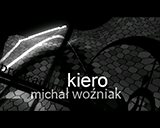
-Loading screen: nice, but it would be nicer if there was a small animation, perhaps with some kind of progress status bar.
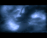
-First scenes: they look quite good and would be nicer with higher framerate. I suspect that the problem is that scenes have lots of polygons and even if Kiero transfered the gfx to chipram in the time between frames are being shown it wouldn't be super-smooth.
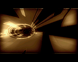
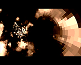
-Bee cells, tunnels, ball with lights. Both effects look quite good although (I see the problem present in latest TBL demos): it doesn't feel much coherent with the epic theme.
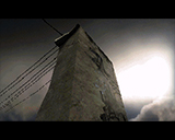
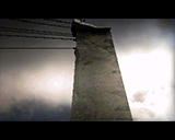
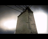
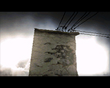
-The part of wall with electricity cables... erm... the 3D engine seems amazing but I think it simply doesn't fit. Ubik is a very talented artist and I'm sure he'll be able to create other 3d objects... imagine the impressive "Lux aetherna..." with a "electricity post"? If it was an industrial demo with a sunset filled with the shadows of electricity posts and the solar panels moving to catch light I would understand it but that beautiful blue sky? The idea of showing letters in the walls is nice but I think next time you should choose something that fits better.
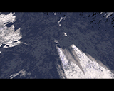
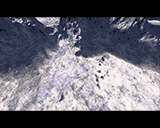
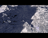
-Mountains: even thought they look quite good and the shadows too the images are too near or the textures are very similar in all the mountain. Or perhaps the angle is too much over the mountain. The user suspects it's a mountain but perhaps it would look better from some distance, with an angle that allows you to say "it's clearly a mountain with its snowed peak". A movement rising from down the hill and going up creates in the user the illusion of height and would make it more impresive. Check out Silkcut mountains (not the ending ones, but the first ones). Don't check out Starstruck ones as these look uglier.
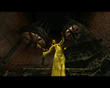
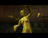
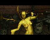
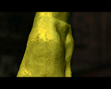
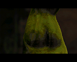
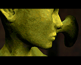
-The statue in the dark room. That scene looks very nice but when the camera moves fast near the face of the statue framerate is too low :-/ perhaps applying some polygon reduction to avoid the calcs of the rest of the body? or using less polys.
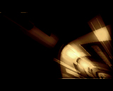
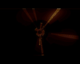
-The flower and lights: beautiful! In some moments the user can notice the polys that create the "light segment" but I really like that scene.
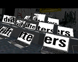
-The laptops part: nice too. Perhaps using more different colours for the floor and laptops so it doesn't look grey-ish.
Conclusion: even if framerate was very nice at 25fps Elude should try to focus on a theme. Choose an "epic industrial" one or an "epic with statues and light rays" but focus at 100% on one and don't mix much elements of the other. Or perhaps you could create some bio-mechanic looking statues built with pieces of metal were you can see marks of screws... I don't know, I'm just a coward that does not produce anything :-/
comment by LordNikon on 18 April 2009
blabla... this one is fu***** great.
Please log in to add a comment!
User Votes: Average: 4.47 points (30 votes) |
Please log in to vote on this production!
|