

















comment by z5 on 12 April 2005
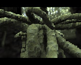
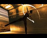
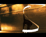
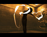
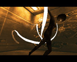
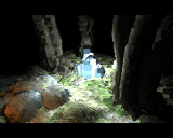
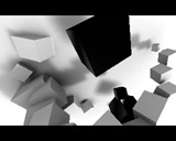
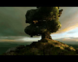
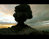
Well, the final version makes this demo even better. The mountain scene makes more sense now, looks better and fits better with the rest of the demo (colorwise). The greetings part (for me the best part in this demo and absolutely superb) is even more beautiful with the color sheme changing. The fading on the credits is nice aswell. I have the impression that the 2nd voxel scene (with the blue "stones") is a bit less blocky now but i would have preferred if they didn't include this part.
All in all, a stunning demo. The only thing left to do for TBL is to design a demo around one theme/look instead of collecting random (really impressive) parts which don't have anything to do with eachother. Seems that few groups manage to design their demo around one theme (Klone and some of the Ephidrena demos come to mind).
comment by dirtie on 18 April 2005
i saw the final version several times its a fucking great thing athough i did not liked the voxel at first. now i know about the complicated programming. and i am looking forward to see how this effekt will be developed in future...
comment by Ralph Wiggum on 19 April 2005
After watching the final version I changed my mind and my vote from 3 to 4 :)
comment by KAM_ on 23 April 2005
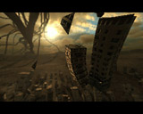
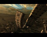
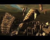
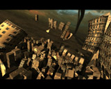
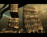
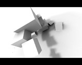
Good demo. I love flying city, greetings part and those white cubes are absolutely fckng great! the music is nice and graphics cute. :) but... what the hell are those ugly huge pixels?! (19th screenshot)
comment by c-frog on 11 June 2005
Smash-hit!
comment by neongod on 13 June 2005
Final version roxx! The voxel routine and music kicks ass! One of the best TBL demos ever.
comment by skan on 29 June 2005
Here it is. The next generation of Amiga demomaking. Just like Tint did 9 years ago.
comment by britelite on 01 July 2005
I like it, I love it, I need it!!
The tune is absolutely amazing and the rest of the demo is just as good. Noone else stood a chance in the compo in my opinion.
comment by skan on 12 September 2005
oh, I forgot: in case you don't like 3D demos, the greetings part it's worth the whole production. Trust me.
comment by rloaderror on 29 September 2005
I sometimes wonder what makes people think an effect is 2D. I once read an article by Darkhawk in EC where he said he liked good old fashioned 2D effects like rotating cubes. ??!?!? A rotating cube is about as 3D as it gets.. The same goes for the greetings part in this demo which also a 3D scene. Maybe you mean the credits part? (with the cool pics) If not, I'm puzzled :S
comment by scicco on 30 September 2005
i'm so with you, lord error.. :)
comment by skan on 30 September 2005
@Espen
Ok, i've not been that clear with my comment, my fault. Or maybe my English is screwed...
What i mean is that some ppl don't like 3d demos just because they're 3d (hi z5! :D ). The greetings in this demo are so smooth and well designed that even such ppl must admit they're cool. i KNOW that's a 3d scene, thanx. ;)
and, btw, the credits part r00lz the same.
and, btw, you could log in #amigascne sometimes :P
@Scicco
:P
comment by z5 on 30 September 2005
oi... don't drag me into this :) I'm not too fond of those 3D STORY demos (Lapsuus, Relic, ...) but that has nothing to do with the demo being 3D or not. It has everything to do with me being more fond of effects instead of animations, or effects combined with animations, but ntot animations without any effects... nuff said...
comment by wad on 05 March 2006
Amazing. And oh, the music!
comment by wayne on 05 March 2006
Hmm 4 nominations for "scene.org awards" that's nice, but i think that it will be like last year with SilkCut... ;o(
Maybe if nothin' more "best soundtrack" winner who knows... ;o)
Please log in to add a comment!
User Votes: Average: 4.63 points (62 votes) |
Please log in to vote on this production!
|